jeudi, janvier 17, 2013

The psychology of color

Companies have learned the lesson of how important the use of color is in their branding.  After all, what is Tiffany's without it's famous robin egg blue or Post-it notes without it's patented canary yellow.  On a fundamental level, we take in information about a brand, product or service by it's color.  Once the color is established for the brand, it has a presence everywhere - packaging, marketing, store or display decor.  This is done to forever associate the product with the color on our brains.  These colors are not chosen hap-haphazardly.  Using the psychological meaning of the color to support the product gives branding more weight.

Case in point, the color red.  Used by Coca-Cola, but also by Virgin and more recently on the soles of classy Christian Louboutin shoes.  Why? Because psychologically red represents power, passion, energy and courage. 

Blue is color that is largely used in branding because it represents trust, integrity logic and communication.  It is the popular color with social media (Facebook, Twitter, LinkedIn) as well as banks and energy providers. 
Brands that use yellow are expressing happiness, optimism and friendliness.  McDonald's capitalizes on the fact that yellow is also the most visible color in daylight, making it nearly impossible to miss their giant "M" signs thus provoking an immediate response from the kids. In the case of the 3M Post-it note, the color yellow was chosen because it is the cheapest color of paper, next to white.  However, the color stuck (literally) and even though post-it notes exist in hundreds of fun colors, the image associate is still yellow. 

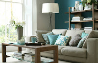
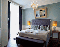
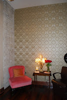
The same color psychology that companies use to brand themselves can be brought into the home using paint, wallpaper or fabric.  For example, the colors: red, orange and yellow are popularly used in rooms where we congregate and socialize because they are colors that represent contentment, energy, and movement.  While cool colors such as: blue, purple and green will make us feel more comfortable in our private rooms (bedrooms and bathrooms) because they support an atmosphere of zen and contemplation.  


www.relookinteriors.com
Color is a powerful tool when you know how to use it.  Finding the right colors, dosage and balance in every room of your house can be a daunting task.  If you are wanting to add color to your home, struggling to find the right mix for your rooms, or just want to know more about how to use color in your home, give me a call! I'd be happy to help you with your color dilemma.

lundi, juin 11, 2012

The Teak takes the floor


The life of an interior designer means occasionally taking on projects at home as well as with clients.  The difference between the two are the projects with clients get done much more quickly than at home.  After sitting idly for almost a year, work on our upstairs bathroom got off to a new start.  Shower and vanity tile were laid first and then came the labor intensive installation of the teak wood "boat deck" parquet over the existing pine parquet.


Our inspiration for the flooring hails from boat  decks similar to this one. We call it luxury yacht meets suburban attic. (photo courtesy of charterworld.com)


We wanted to create a unique separation of space between the bathroom and the rest of the attic without constructing hard walls that would close off the vaulted ceilings.  This floor helps distinctly define the bathroom space. 


The intent was not to create a nautical style bathroom, but a cozy zen atmosphere that touches all the senses and reminds us of our fun sailing experiences.  Besides, teak wood is exceptionally waterproof (provided you keep it oiled up) and is warm and smooth underfoot.  

Here's how we did it.  We chose to glue the parquet directly onto the existing pine flooring to form a mosaic pattern varying the length of the lat and the wood tones.  The parquet we purchased had pre-routered joints which we filled in manually with black epoxy, however teak wood parquet is also available with integrated joints for a quick install or when laying surface area larger than our 9m2.

 The next step was to tape either side of the horizontal joints so the black epoxy could be filled in without making too much of a mess on the wood.  A very time consuming and knee aching task, not to mention the obscene amount of blue tape we used.  


The epoxy was applied using a caulk gun then with the help of our little blue spatula was spread evenly to fill the groove.

Special thanks to Dean Wilson for his expertise on boat decks and joint filling techniques.

After the epoxy formed a "skin" the tape was removed to reveal a parquet with joints in tact.  

The joints were left overnight to dry thoroughly before attacking the trimming and smoothing.
The final step was to trim (with the help of a razor) the joints with excess epoxy.  The floor was then sanded using a Scotchbrite floor-sanding disc instead of an abrasive.  The last tedious job was to scrape the wood surface on other side of the joints where the epoxy had expanded leaving a precise, smooth to the touch, finish.  2 coats of oil were applied with a brush and a third will be added after a quick pass with our floor sander. 
 
This is the finished look.  If you have any questions about the process or the materials we used, please feel free to contact me. 


Now onto the plumbing...  


Stay tuned to future articles that follow the advancement of this project.


As always, if you need help pulling together your at-home DIY projects or are seeking the advise of a decorating professional, here's how to reach me: angela@relookinteriors.com

mardi, mars 20, 2012

Spring is in the air

It's official, today is the first day of Spring! In honor of this yearly event and to help you get into the mood, here are 5 ways to welcome the season into your home.

1. Shed the layers: Do you still have that fuzzy throw over the back of the sofa and candles on your end tables? Now's the time to put away those warm reminders of winter. Try some bright throw pillows for the sofa or change your curtains out for lighter, sheerer ones. Even small changes like rolling up your rug and exposing the floor for the warmer months will lighten the feel in your room.

2. Rethink your room: Do you have the itch to rearrange your rooms? Go for it! Think of ways to open the space and reduce cl
utter areas that seem to grow over winter.

3. Clean sweep: Spring is naturally the season when we tend to deep clean. Windows get washed, fireplaces get cleaned out, and drapes get dry cleaned. Why not also take the time to de-clutter your rooms. Clean out cupboards, drawers, shelves and go threw any piles that have accumulated over the winter. Spring is also the season for flea markets and what a great
opportunity to get rid of the stuff you don't need anymore and make a bit of money.

4. Surface makeovers: While dusting off your shelves, why not give your eye a change of pace for the season. Display your china, crystal or glass. Buy a couple of small green plants or a fresh bouquet of flowers to adorn your mantel.


5.
Bring the outdoors in: Even if the temperatures are still too cold for T-shirts, you can bring that sunny feeling indoors. Incorporate garden furniture into your home, replant your houseplants in terracotta pots. Use floral fabrics to brighten up your rooms and by all means open up those shutters and curtains and let the sun shine in. (photo: Designer Dad)

Happy Spring relooking to you all.

jeudi, janvier 26, 2012

What's new for 2012

What do I love most about moving into a new year? Seeing what will be popping up in the world of interior design, of course!
This year, largely due to the fact that the economy is keeping people put in their current homes, there is a lean towards recreating rooms that have become boring by incorporating small affordable changes that offer a maximum of comfort and personality.

Let's take a closer look.


Color trends:
Adding color to a bland room is the most effective and affordable way to make a change to a room. This year vivid colors (especially jewel tones) are put in combination with ivory, brown, silver, and camel/caramel yellows for a chic and comfortable atmosphere. Keep in mind to balance the color scheme in your room - 50% neutral, 30% color, 20% coordinating or contrasting accent color.

Materials and textures:
This year the push is towards smooth glossy surfaces and luxurious textured fabrics. Velvet and polished wood fit well into the continuing trend of the industrial look. Whereas tufted upholstery and sleek steel or glass fit well together for a chic vintage room makeover. Introducing rich fabrics such as silks, wools and velvets in patterns and solids in the form cushions, draperies, and rugs add elegance and comfort at an affordable price.

Decor and more:
This year the trends are mixing decorative accessories made of materials such as stone, metal, wood and glass - think polished, shiny and flashy. Large mirrors and mirrored tiles as well as metallic or beaded wallpapers can also be a unique and spectacular addition to your rooms. That being said, your choice of decor should enhance the existing style of your rooms. It should represent your unique character and work as a whole to bring your room to life.


With trends coming and going year by year, most people are hesitant to incorporate them into their homes for fear they will go out of style too quickly or cost to much to implement. However, while working with clients I find most of them already have the latest trends lurking on their shelves or in their closets. Yes, recycling an old stained embroidered tablecloth from your mother-in-law into throw cushions for your bed or repainting that tired end table high gloss black are low cost relooking options that people don't even think of. So if you're inspired by these ideas and need help getting your new look or want some ideas on how to update your rooms. Give me a call. Happy relooking for 2012!

mardi, janvier 03, 2012

Ringing in the New Year

Happy New Year. May 2012 bring health, happiness and peace to your home.